The ability to create zones on a screen layout, and show different material in each of those zones, is very common across digital signage platforms. But it’s a capability that should only be used with careful thought.
Here’s why …
With some exceptions, digital signage is a glance medium. People don’t “watch” digital signage screens the way they watch TV at home. They look for a matter of a few seconds, not minutes or even hours.
The more information that gets put on screens, the less likelihood that the “money” message will be seen and remembered. So if the digital signage network is running in retail to influence shoppers, those offers and calls to action should be all that consumers see.
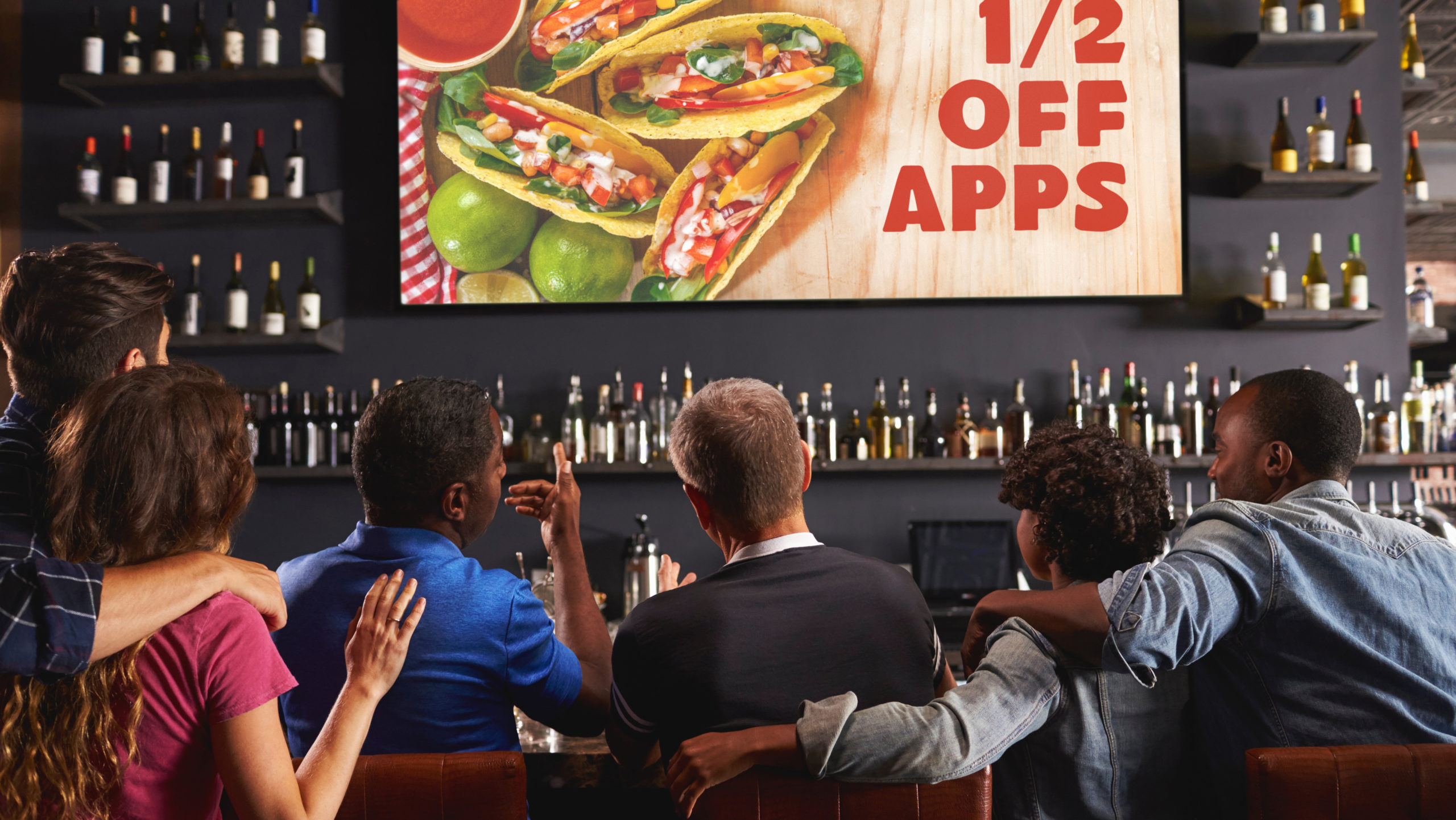
Software makes it very easy to break a standard 16:9 widescreen layouts, or 9:16 portrait version, into multiple zones that can be configured to show and cycle through different information pieces at the same time. It’s possible, let’s say in a sports bar, to have on one screen, at one time, an appetizer promotion, an events calendar, a logo for a beer brand and a sports score ticker.
There could also be a clock, but bar owners don’t tend to want to remind people they really ought to head home!
On that bar screen, what really matters is the appetizer promotion, whether there’s a good margin in those orders or an apps plate that keeps people around for an extra drinks order. But viewers might not see that offer because there is other information on the screen to distract them.
Saying “might” suggests speculation, but there’s data behind it. The numerous companies that market AI-based audience measurement solutions – software that logs how people look at screens – will tell you that viewer attention times are fleeting. Typically, people look at digital signage screens for three or four seconds, and then their eyes go elsewhere. They may look more than once, but they don’t tend to lock on and make an effort to fully ingest what’s displayed.
These zoned screens are, in many ways, a relic of the early days of digital signage, tracing back more than two decades. Back then, there were very few software options for putting messaging on screens, and marketers and entrepreneurs turned to applications that were developed for cable TV operators.
These companies had software that was used to run things like TV guide and community information channels, as well as 24/7 news channels. Many of those end-users broke their screens up into zones because they had a lot of information to convey and an audience that was watching for extended periods.
So when the capability exists in software, why not use it? Well … because in many to most digital signage applications, it can be counter-productive.
This is not to suggest using content zones is never a good idea.
A great example of instances where multiple zones work well is in waiting room areas, where people are called up by name or are issued a number. A screen relaying the wait status is incredibly sticky (people look at it again and again), so one zone can be showing status and a second zone doing customer messaging that will get seen and be effective.
In a condition-specific health clinic, it can be health advice. In a passport office, information on online options. In an auto dealer customer lounge, announcing new vehicles or driving awareness of season service specials.
Bottom line – Just because something is possible doesn’t mean it is wise. Go ahead and zone your screens, but only when the need is well defined, and the dynamics make it sensible.
